Website accessibility refers to the ability of a person to access a website regardless of disability type or severity of impairment. When putting together a website we don’t often think about how someone other than ourselves would be using the site. Even less often, still, do we think about how someone vastly different from ourselves would be accessing our site.
For example, if you were color blind (and maybe you already are) how would you perceive your business’s website? Would your CTAs still stand out? Would you still know what is a clickable element from the existing visual cues?
When designing, developing and maintaining a website there are elements of website accessibility that really should be taken into consideration so as not to alienate any segment of your potential audience. With this website accessibility checklist, you will be armed with the tools to start taking a look at your own site from a broader perspective.

First, how about some perspective
Web Content Accessibility Guidelines (WCAG) are a set of rules designed to provided guidance on items that should be addressed to ensure that no users are excluded from using the internet. To understand a few of the types of impairments that WCAG is meant to help, we’ll take a look at some statistics of a few disabilities in the U.S.
- 8 percent (26 million) of men and 0.5 percent (1.6 million) of women are color blind in the U.S.
- 15 percent (48 million) of adults are hard of hearing.
- 11.4 million (3 percent) of people have visual impairment, while 1 million are blind (0.3 percent).
- There are an estimated 285 million visually impaired people around the world, with 39 million fully blind.
That is an awfully lot of people, with an estimated 27 percent of the population having the above impairments, not including physical impairments that can hinder how a person might be able to interact with a website. Do you want miss out on the opportunities reaching this audience could lead to? Or, more importantly, do you want to exclude over a quarter of the population from getting any meaningful engagement on your website?
The good news is that WCAG 2.0 and 2.1 standards clearly document what site operators should do to improve accessibility . Initially, it may seem like an incredibly daunting task when looking at all the technical requirements, but bear with me and I’ll break down a simple, abbreviated website accessibility checklist of items that most users can easily address themselves.
Performing a web accessibility audit
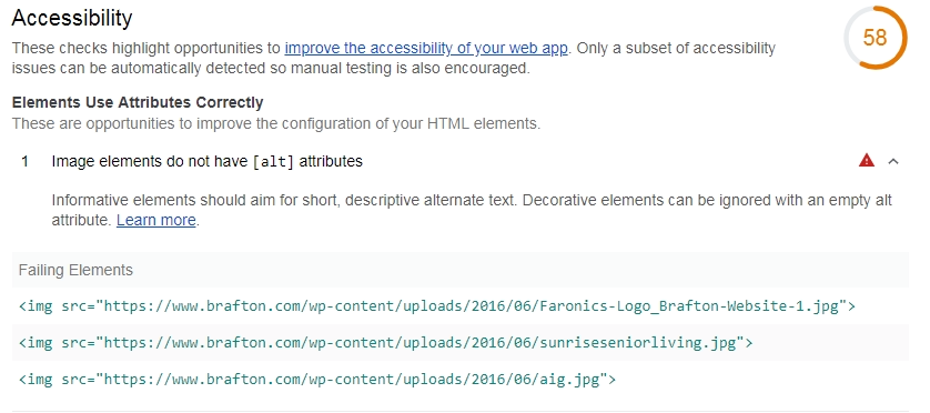
We took an audit of Brafton.com as part of an initiative for 2018 and didn’t do so well. But the good news is we easily addressed a few key items and were in much better shape. Below you can see the details of our audit and what we learned in the process. Using this simple website accessibility checklist, in conjunction with Google’s Lighthouse tool, you too can begin updating your site to meet WCAG standards. Comparing our scores for Brafton before and after, we’ll go through our checklist and highlight what we did to correct our mistakes.

As you can see, we started with a score of 58 on accessibility, but we at least scored 100 on SEO. That would have been otherwise embarrassing.
1. Content is accessible via the keyboard and elements are identifiable as selected.
Can you use just a keyboard to navigate your site and move through the content? This is an item that most often an automated tool can not determine, but you can easily test out yourself.
2. All images have alt text.
Alt text isn’t just used for best practice on SEO. Alt tags are also used for screen readers to determine the context of the image. Proper and descriptive alt tags are essential for the visually impaired user.

We had a few items to address here, but these are usually simple fixes. Most often this is simply a matter of updating a field in your CMS somewhere. One key factor to remember is ALL images should have an alt tag <img alt=””/> even if it is just an empty one. An empty alt tag signals that this image is purely decorative and holds no content value. Empty alt tags are routinely used for logos or for decorative separators.
3. Content does not blink for more than 3 seconds.
Ensure that if you have any blinking text or other elements on your site that they don’t blink for more than 3 seconds. Remember those old cartoons that blinked so much that kids started to have seizures? We really don’t want that to happen to a user on our site.
4. Aria labels are present.
Some items on your site such as navigation or forms may require additional markup to indicate to screen readers and other assistive technology what their purposes are. Using Aria tags accomplishes this. While this item does require a bit more technical knowledge, it should still be noted.
5. Links have discernible names.
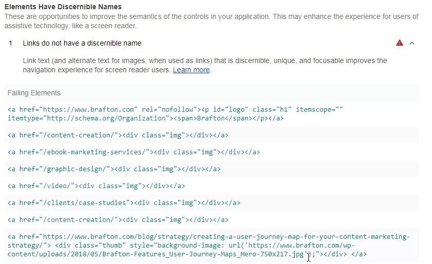
Make sure that all your links have a clear and discernible name for people who may be visually impaired. If images are used for links, this means ensuring they have alt tags.

We had quite a few items to fix in this category. While building our site, we used a few tricks to get our content and images to look the way we intended. Since we didn’t really consider accessibility during our initial build, we had some minor work to do in order to meet the guidelines.
6. Proper heading hierarchy is in place.
Hand in hand with SEO optimization, ensure that your pages use proper <h> tag order. Website visitors using a screen reader will use <h> tags to determine the hierarchy of your page and present the visitor with those items for easier navigation through the content.

7. Using semantic language (<main> for main content <nav> for navigation inside a <header>).
When building pages and templates, there are specific items that by their nature describe the content held within. Some common examples are the <nav> tag, where sites’ main navigation should be placed. The main navigation is also generally provided in a <header> tag, indicating it’s the header of a page. Other tags that are commonly used are <footer>, <article> and <section>.
8. If using charts as images, text alternatives are provided.
Oftentimes, providing graphs and charts is a great way to add rich content to your pages. When adding these elements, however, you should always make sure you provide alternative content either in alt-text format or full descriptions, and break down the context and meaning in text.
9. If using video/audio transcripts, captioning and/or descriptive text is provided.
If your site has videos or audio embedded, there are many requirements to bring this type of content in line with WCAG standards. Most of the videos you find on the web don’t meet WCAG standard, and, yes YouTube is one of them (though this is due more to the users uploading video than YouTube’s incompetence). It is always a viable option to add subtitles to your videos to meet the WCAG standards and make your digital content more accessible for hearing-impaired people.
10. Color contrast is sufficient.
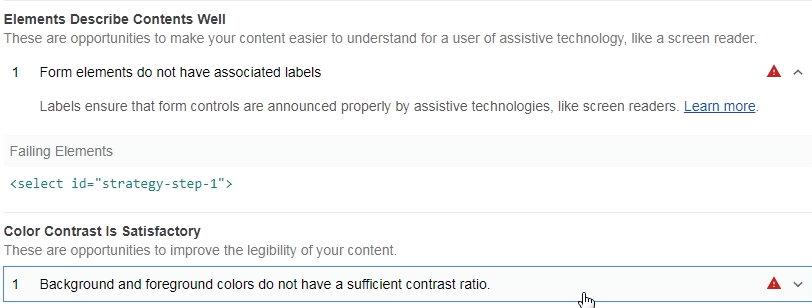
Another Brafton failure in design, though one we did not fix. Proper color contrast is important for visual impairments including but not limited to color blindness. For Brafton, we found that our ever important Brafton green with white text did not meet the color contrast ratio of 3:1. Because this is a branding issue, we will be revisiting this at a later date, but we opted not to make this change at this time.
While designing your site or making changes to your existing one, being conscious of the color choices you make will prevent you from falling into the trap that we fell into.
11. Page elements describe the contents of what is on the page.
Just as important as the content on your page, adequately describing that content is paramount. This goes hand in hand with using proper HTML elements on your page but can go a bit deeper.

Our audit of Brafton found that we had a portion of a form on our page that didn’t provide context to the visually impaired, even though someone looking at the site could intuitively determine what the element was for.
By adding a label with a for=”” attribute, we can specify which portion of the form the offending <select> tag corresponded to.
12. Errors are clearly indicated.
When errors occur, and they inevitably will, ensure they are clearly indicated to the user. Common items are form fills with required fields that may have been missed, or failure to produce an expected result when a user clicks an element on your page.

So after all was said and done, we brought our score from 58 to 94.
It may be worth noting that we could achieve a perfect 100 if we decided to adjust our color scheme to fully meet color contrast standards, but, as mentioned, we’re tabling that for the moment.
We did take the time to fix other areas of our site not linked to accessibility while we were at it; after all, we couldn’t leave all that yellow sitting there.
Although these tools and this checklist can help you get started, there are many technical and visual requirements to meet the legal standard for compliance. If your business requires compliance as part of any legal requirements, it’s best to consult with an expert firm that focuses on website accessibility for a comprehensive audit and implementation strategy.


