Did you know that you swallow about eight spiders while you sleep every year?
Whether you just suffered a full-body cringe or laughed at this oft-cited false statistic, you now have a reminder that data is a tool for illumination or misdirection. In fact, the latter goal is what led to the phony figure, courtesy of a 1993 column from Lisa Holst, where she produced the false information to show how easily it could proliferate.
With all the talk of fake news, what better time to talk about content writing techniques related to the proper and effective use of data?
To be sure, not every misuse of information is malicious. Sometimes, you just hit the wrong key when typing a figure. What’s more troublesome is when inaccuracies arise from misinterpreted data. Another issue is content offered without context, which can create more misunderstandings.
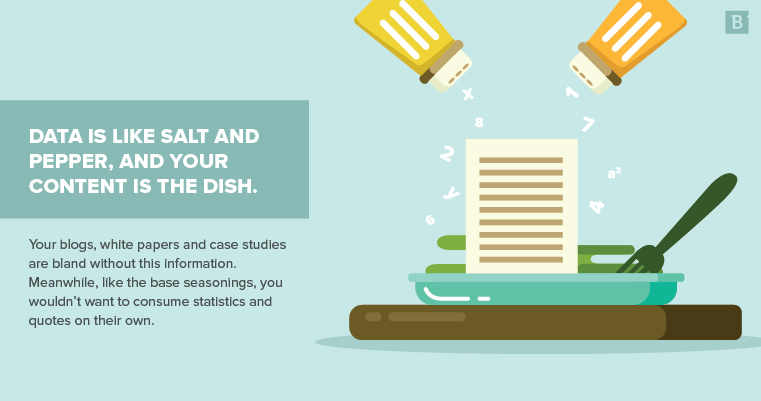
Data is like salt and pepper, and your content is the dish. Your blogs, white papers and case studies are bland without this information. Meanwhile, like the base seasonings, you wouldn’t want to consume statistics and quotes on their own.
What’s the deal with data?
All writing is persuasive in some form and has a main argument. These key points need supporting claims.
Data helps you make arguments in your content more believable.
If you’re a mortgage lender, each piece of content has the subtext that the market is viable for a home purchase. So you can include data like statistics from CoreLogic showing a dip in home prices or an embedded tweet from an industry influencer who says now is a good time to buy.
In rhetoric, there are three rhetorical appeals that map to the different ways you can leverage supporting information:
Logos
The first appeal is about logic and typically applies to quantitative data. Percentages, averages and other data composed of a numerical figure falls into this category.
Here are some examples from our overview of worthwhile content marketing metrics:
- “Though 91 percent of B2B marketers employ content marketing, just 34 percent qualify their efforts as ‘sophisticated’ or ‘mature.’”
- “Content marketing, as a methodology, is 62 percent cheaper than outbound marketing and produces three times as many leads.”
- “We increased inbound leads 105 percent during the same timeframe.”
Logos is the appeal that can appear most objective compared to the other two. As-is and without context, the figures above don’t change from reader to reader.
Ethos
Your status as a thought leader impacts the second appeal. Ethos refers to author credibility.
Part of this work happens beyond the content. For instance, your About Us page and customer testimonials supply ethos.
When potential and current customers review these assets, they have more reason to believe in your expertise based on your organization’s past success.
The same is true of my bio below. It tells you about me and my authority to speak on matters presented in this article.
Pathos
The final appeal is one that caters to emotions. You can address matters of the heart directly or by way of the brain.
Anecdotal and zinger leads are two good ways to target reader feelings. Our call to action on personalized content in 2018 does this work:
“(Personally, I see lots of skincare brands, pet products and art supplies, all of which definitely catch my interest.)”
This anecdotal aside pulls in readers who have possibly seen the same kinds of ads and can remember how they felt when they saw personalized content for the first time. Plus, it establishes kinship between Senior Writer Autumn Green and the audience, showing that she, too, has marveled at the web’s ability to show us ads for the face mask and dog treats we actually need.
Statistics have the same effect when you include a jarring figure. Think back to the faux fact about spiders cave-diving into our snoring mouths. True or not, the statement serves to shock readers into taking interest while giving them a logical, tangible bit of information to ground their fear of swallowing Charlotte, Shelob or Aragog while they snooze.

How do we think about data?
Now that you have some sense of why details such as statistics are used in persuasive writing, let’s examine the types of data at your disposal.
This information falls into two camps: quantitative and qualitative.
Quantitative
As mentioned earlier, this category refers to things you can count. The objective nature of this classification is that a basket of nine apples is still a basket of nine apples regardless of who’s looking at it.
Here are some digital marketing metrics that are quantitative:
- Bounce rate.
- Time on page.
- Unique visitors.
- Click-through rate.
- Open rate.
You express all this data as numbers. This includes numerals, ordinals, ratios and percentages.
Qualitative
This category is about the quality of a subject. Compared to quantitative data, this classification has more subjectivity.
Think about survey data with responses like “good,” “very good,” “below average” and “meets expectations.” What one respondent labels as good is not the same as another respondent’s perception.
Case studies are a wealth of qualitative information. In our look at how we’ve provided a return on investment for Jagged Peak, the quotes from Kristine Champion, Jagged Peak Director of Marketing, illuminate how the organization benefited from Brafton services:
- “The content you produce is on key, and it’s clear you understand the pulse of our industry.”
- “The value I see in Brafton is that it’s like having an additional arm to take some of the load off us.”
- “If our team is strapped for time when coming up with new ideas, Brafton proactively pitches several stories for us to approve or collaborate on.”
This data doesn’t include statistics but still provides insight into the positive five-year relationship Jagged Peak has had with Brafton.
What are some guidelines for using data?
As the old quote from earlier Spiderman films goes, with great power comes great responsibility. The same goes for information you use in content.
The data you use must be useful to readers and your argument. Also, you shouldn’t misrepresent any quotes or statistics you include.
Here are some tips to help you get the most out of cited details:
Meaningful use
Between 1980 and 2014, the number of people worldwide who have diabetes climbed from 108 million to 422 million. This is a fact you can toss out to amaze friends with random knowledge, but it doesn’t aid our discussion about using data in writing.
Supplementary information should enhance and relate to your claims. The diabetes stat is a more extreme example, but some misuses appear more benign.
In a white paper about the benefits of telemedicine app development, for example, the figure may seem more appropriate – a health care stat for a related technology. However, unless the article delves into how telemedicine helps diabetes treatment specifically – or even chronic illness – the information doesn’t give readers a better understanding of the scope of improvements in patient outcomes.
Sometimes, the data is related, but you need to establish the tie-in to make connections clear for readers.
Set up and takeaways
Two ways to establish relevance are to lead up to and follow data with context. These details tell readers why they should care about a quote or statistic.
Setups and takeaways are necessary for figures and direct quotes, and they can prove crucial for data.
Think about the diabetes statistic again. Sure, it mentions the increase over the 34-year span, but what does the figure mean outside of itself? Is that rise in line with population growth, meaning the proportion of people with diabetes didn’t change? How does that period compare to others?
You don’t want to make up conclusions, but look to other sources and industry expertise to form an analysis that you can then synthesize and present in the content. Without guidance from some copy to act like highway on and off ramps to and from the data, readers have no idea what to do with a neutral figure.
A sentence or two before and after a quote or statistic usually suffices.

Connections between data
Keeping with the seasoning metaphor, you can bring forth more powerful flavor notes by drawing lines between and combining the data you include. Information from one source can make details from another more potent.
Each month, the Census Bureau releases new residential sales data. After those figures arrive, the National Association of Home Builders publishes a statement to respond and offer its insights on what the raw Census figures mean for the market, often including quotes from its leadership.
A less direct tie-in to the Census data could come in the form of new home price data from numerous housing market indicators. This supplementary data gives zest to a lead about an increase in sales of new residential properties.
The goal is to intermingle all source information through original analysis.
Accuracy
It’s easy to accidentally misrepresent data. Here are some pitfalls to avoid:
- Correlation as causation: If, for instance, you found $20 while reading the intro to this article and another $20 by this point in the story, you could say your funds increased as you progressed through the article. However, without proof that reading more of the article prompted the appearance of the money, you can’t say reading articles about data magically makes cash appear. Clickbait headlines often purposely confuse correlation and causation. Don’t mislead your readers.
- Misquoting: It’s illegal and unethical to change direct quotes, especially in an attempt to alter meaning. If speakers want to update their quotes, they should submit consent in writing.
- Unsubstantiated analysis: When the monthly Bureau of Labor Statistics report details how many jobs employers added to the economy, that data applies to only the number of positions offered. A novice citation could misuse this information to say employers filled a certain number of jobs. Pay attention and adhere to what the source actually says.
- Editorializing: With marketing copy, it may seem inevitable to blur the line between fact and opinion. The key is to aim for context, not judgment.
Issues like the ones above are why fact-checking is an integral part of our editing process. This verification step guards against legal risks and misleading readers.
Audience
Consider your readership when developing brand guidelines around data use in content. Based on your personas, the amount and kind of information you present changes.
Authoritative B2B content can benefit from more statistics. On the other hand, conversational B2C work is typically more suited for quotes and figures paraphrased with terms like “the majority of” and “more than half.”
How much data is too much?
Remember, quotes and statistics aren’t the dish; they’re the base seasoning. Just as oversalted or peppered food tastes terrible, so will your content if you go heavy on the data and light on the original analysis.
Thought leadership is about having a pulse on the industry and offering unique, insightful responses to what’s happening.
Just don’t forget to cite your sources!


